NASA LIFELINES
Brand Identity Design
CLIENT
DevGlobal Partners
NASA
TIME
Summer 2023 (2 Weeks)
TEAM
Beatriz Lozano, Creative Director
Karan Kumar Sathis, Designer
Xiaoyu Xue, Motion Designer
Anushka Vhatkar, Designer
Brand Identity Design
CLIENT
DevGlobal Partners
NASA
TIME
Summer 2023 (2 Weeks)
TEAM
Beatriz Lozano, Creative Director
Karan Kumar Sathis, Designer
Xiaoyu Xue, Motion Designer
Anushka Vhatkar, Designer
NASA Lifelines exists to bring experts from different sectors, disciplines, countries, and backgrounds together to use our incredible assets in space to improve life here on Earth. Lifelines is increasingly aware that putting science into the world is insufficient. "We need to understand how this knowledge can be helpful to people on the ground, how satellite data and models can be even more useful, and what additional questions and needs surface as a result."
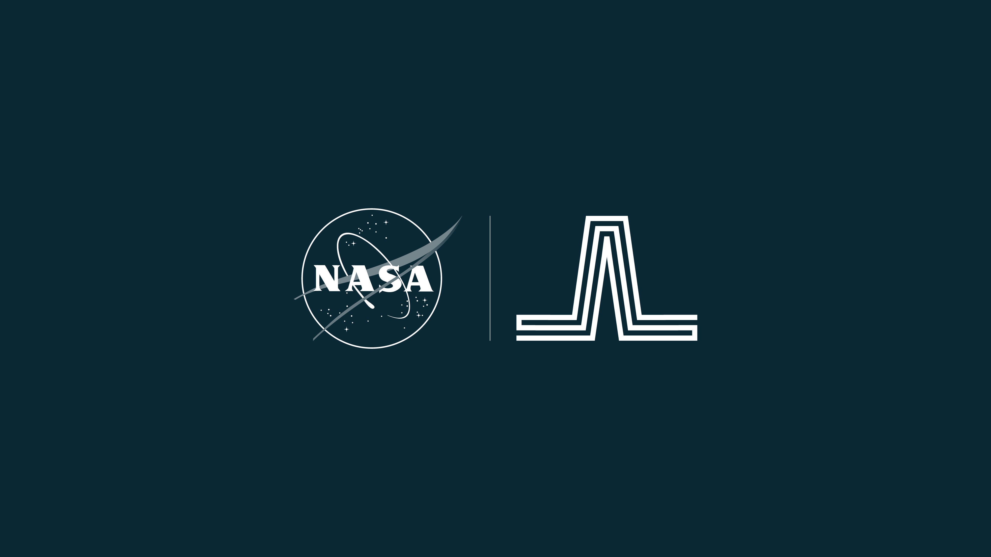
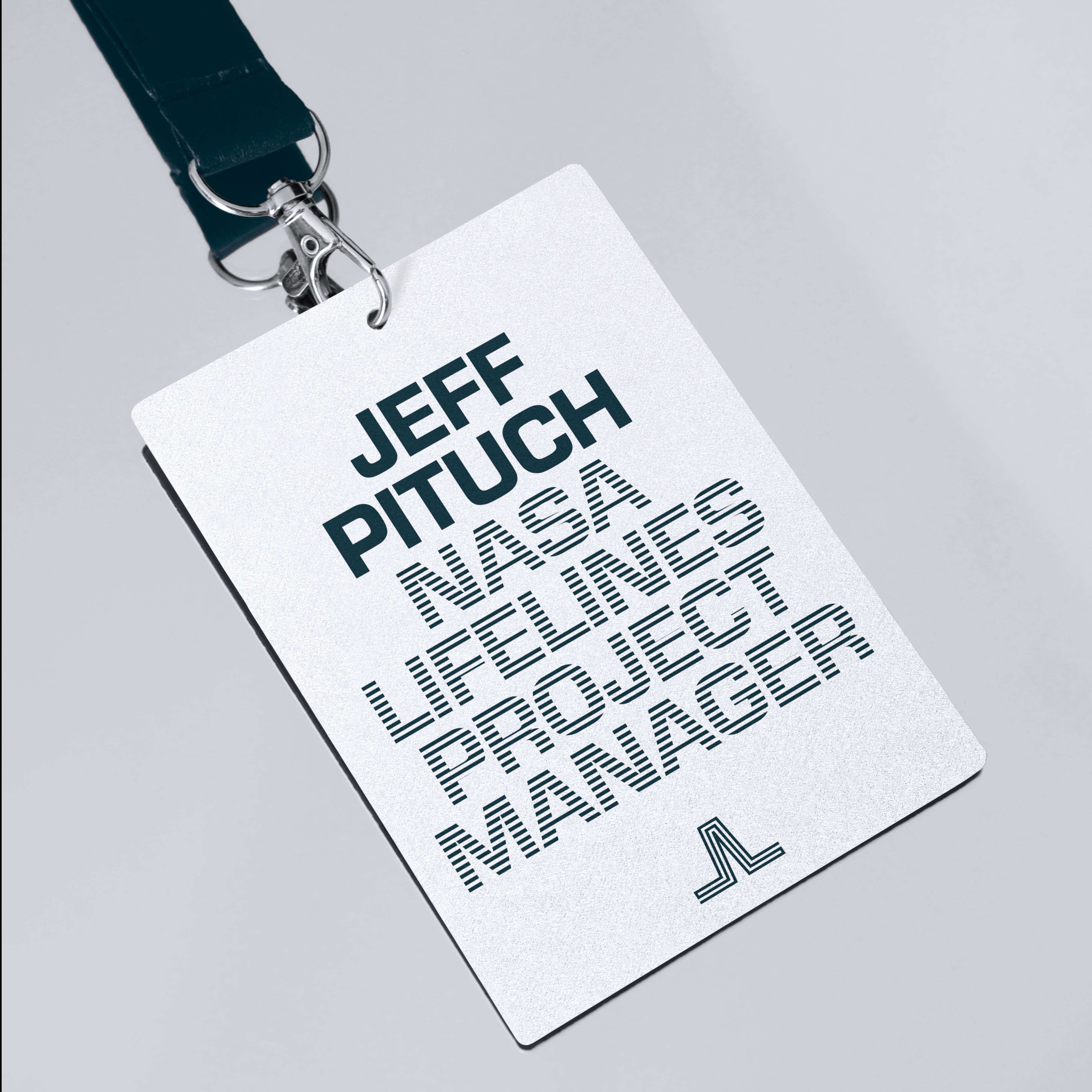
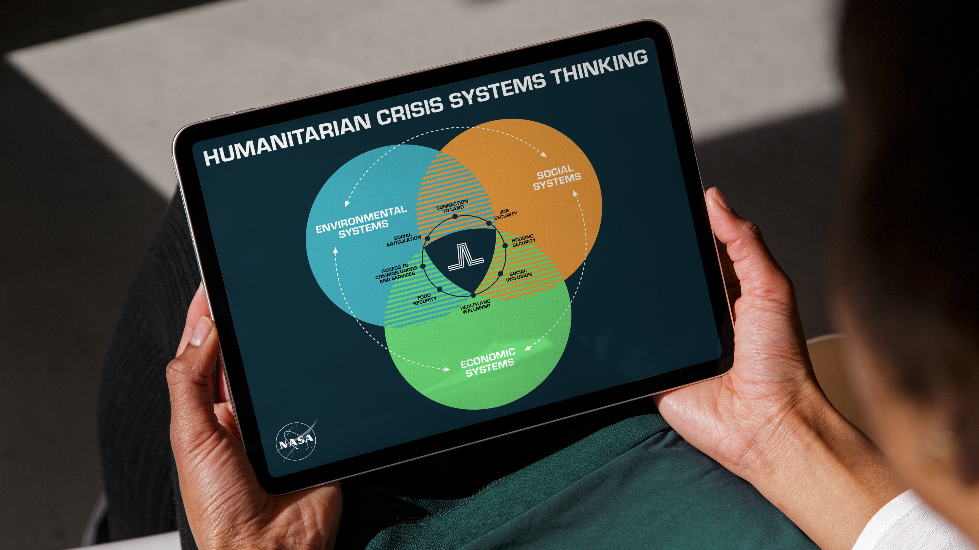
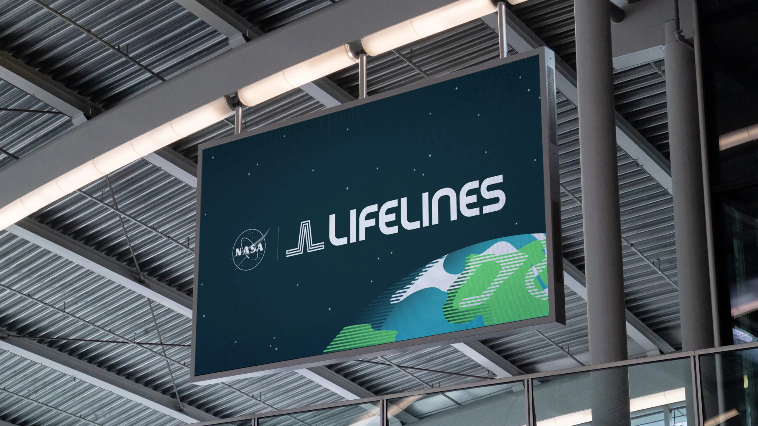
We worked closely with the NASA Lifelines team to develop their visual identity, rooted in community, science, and humanitarian efforts. The logo is comprised of custom-drawn lettering paired with an icon mark. The mark is formed from two mirrored 'L's, that when connected create a peak symbolizing a life signal, as well as reference the shape of the satellites used to collect space data. Most importantly the mark is created from a singular continuous line symbolizing the connectivity that grounds every aspect of this program. This linear icon served as our inspiration point as we developed a flexible line-based system that expanded into the illustrations and typographic treatments.
We worked closely with the NASA Lifelines team to develop their visual identity, rooted in community, science, and humanitarian efforts. The logo is comprised of custom-drawn lettering paired with an icon mark. The mark is formed from two mirrored 'L's, that when connected create a peak symbolizing a life signal, as well as reference the shape of the satellites used to collect space data. Most importantly the mark is created from a singular continuous line symbolizing the connectivity that grounds every aspect of this program. This linear icon served as our inspiration point as we developed a flexible line-based system that expanded into the illustrations and typographic treatments.